Tailored search, building systems from 0 → 1
● SHIPPED

Role
Lead Product Designer
Timeline
3 months
Product
Web, mobile
Team
1 Brand designer, 2 engineers
OVERVIEW
Helping people find internet they can actually trust
BroadbandNow helps consumers find and compare local internet providers. The site makes revenue through click-outs and phone calls — so trust and clarity aren't just UX goals, they're business ones.
My impact
Led & Shipped 0 → 1
End-to-end redesign of search results experience
Secured CMO Buy-in
Presented research-backed mockups that unlocked budget for a full site redesign
Reduced Dev Time by 50%
Built the company's first design system — establishing consistent branding and engineering alignment
Aligned 5 Teams, Saved 6 Weeks
Created a strategic roadmap that unified cross-functional teams around a single north star vision
CONTEXT
A history of "Well, we don't do that."
A/B testing one button. Tweaking one component. Optimizing in isolation — without ever asking whether the broader experience was working for real people.
I wanted to zoom out.
Instead of guessing, I initiated user research, built high-fidelity concepts, and brought the findings to leadership. Not as a request — as a case. I showed them what was broken, why it mattered, and what it could become.
They greenlit the full redesign.
PROBLEM
The site was built for Google, not for people
BroadbandNow ranked #2 for "internet providers near me" — but ranking didn't equal converting. The experience was optimized for search crawlers, not the humans actually using it.
BUSINESS PROBLEMS
Low conversions
Users weren't clicking out or calling providers
Ranked #2 not #1
Meaning millions in lost traffic
Technical debt
Hard-coded site made every update painfully slow
USER PROBLEMS
Trust
Brand inconsistencies made the site feel untrustworthy
Difficulties comparing
Hard to differentiate and compare between provider plans
Results felt generic
Nothing felt relevant to you


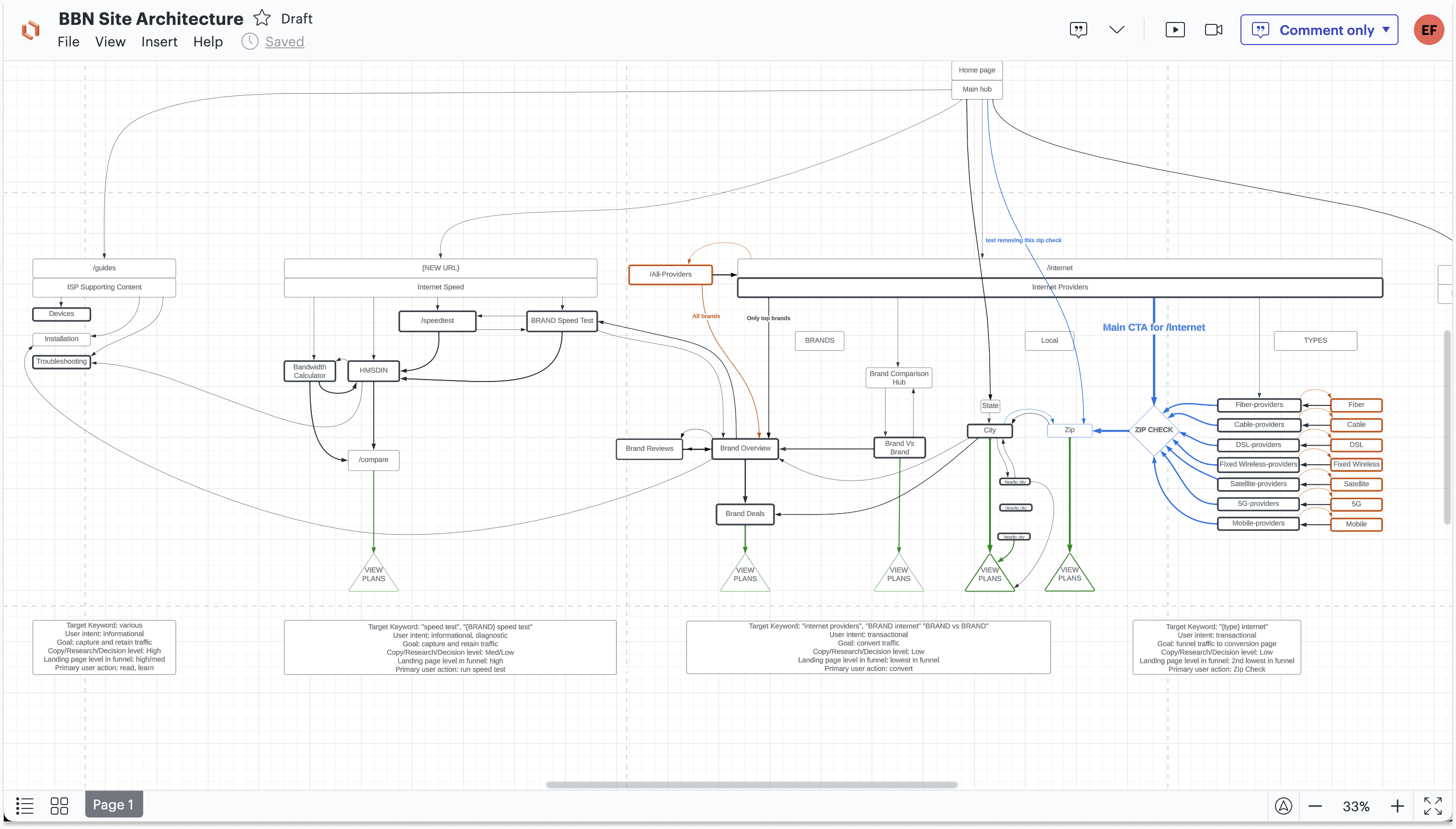
SCOPE
Shipping a redesign from 0-1
We built the process as we went.
No defined workflow existed before this project. What you see here looks linear — it wasn't. Branding, wireframes, and user testing often ran in parallel.

GOALS
#1 on Google, trusted by users
Redesign the core search experience to increase conversions and make BBN the go-to resource for internet plan comparison.
DISCOVERY & DEFINE
Understanding what we were working with
We audited the existing site — mapping page flows, flagging usability issues, documenting components, and identifying redundancies. Before designing anything new, we needed to understand exactly what was broken and why.
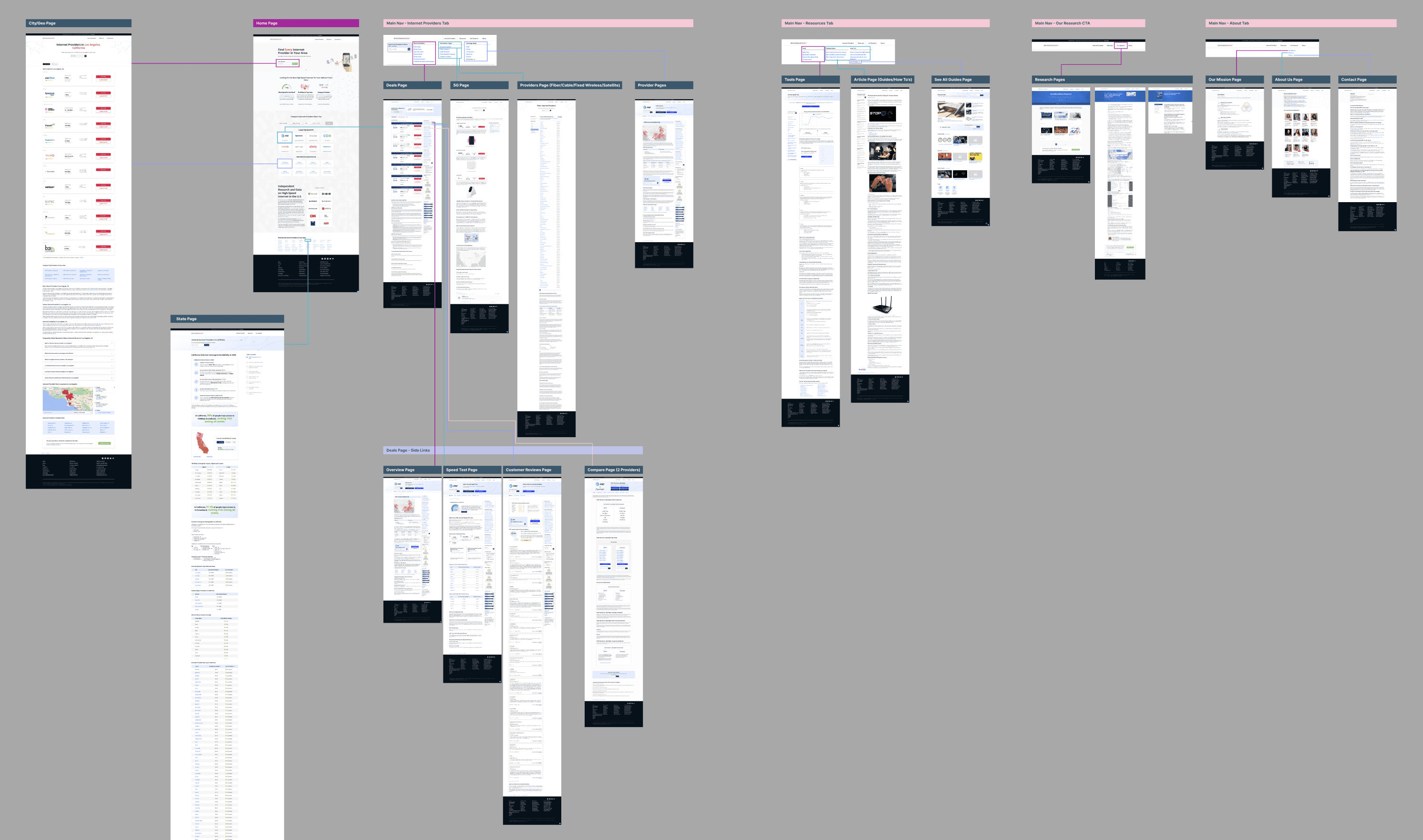
We aligned with SEO and engineering early.
Before designing anything, we met with the SEO team to understand Google's requirements and future site architecture, and with engineering to surface technical constraints we'd need to design around.
We studied the competition.
Specifically High Speed Internet — the site ranking #1 above us. Two things stood out:
Their cards were more scannable, surfacing only the most critical information
They prioritized location-based personalization to show the most relevant options first

RESEARCH
What we learned from watching 40 people search for internet
How do users search for and compare internet providers?
What information actually drives their decision?
Where does our current experience fail them?

What they needed:
A reliable provider available at their location
Price and speed front and center — those were the deciding factors
A fast, easy way to compare plans side by side
What frustrated them:
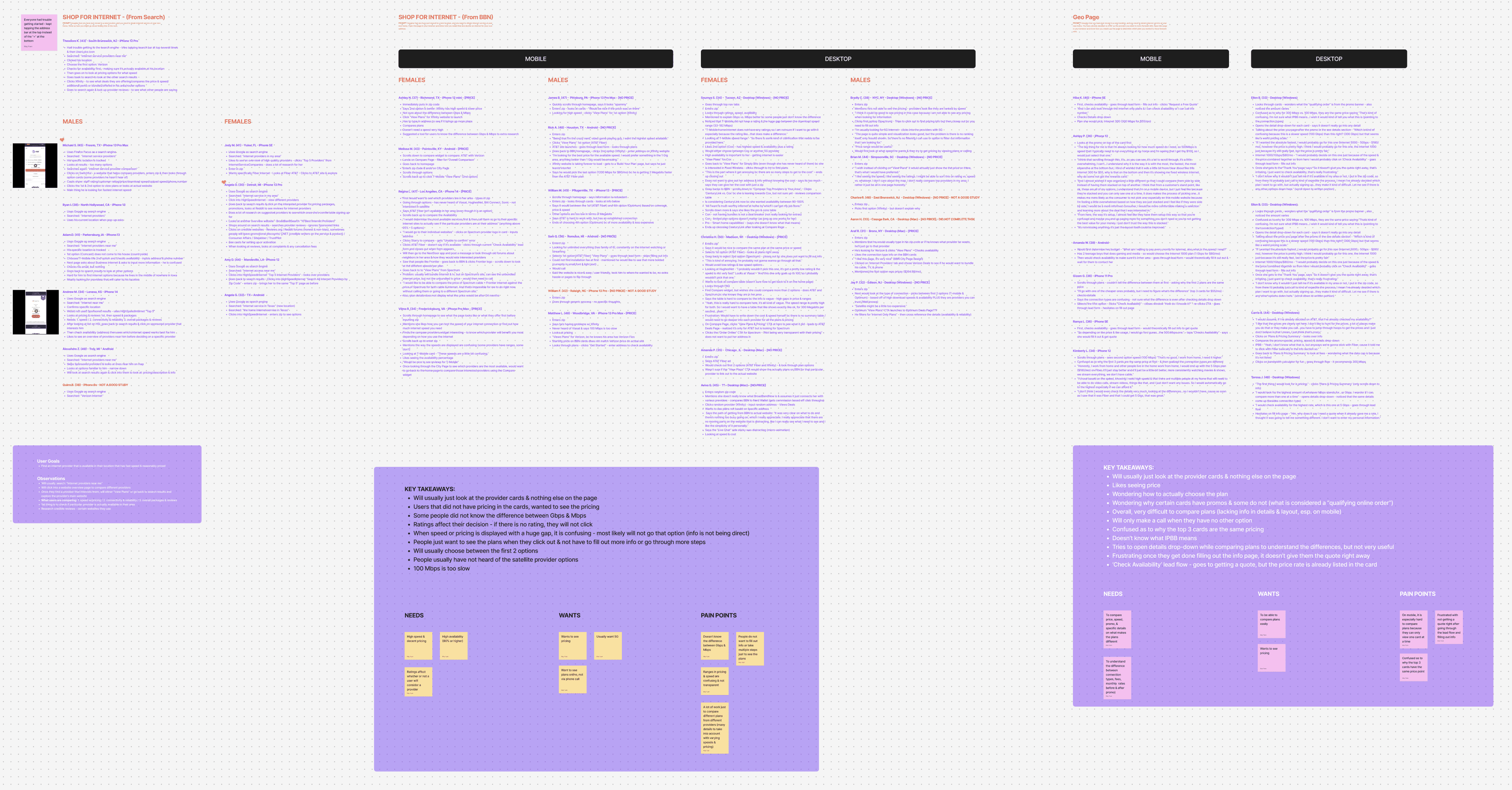
In their own words
"These options are not relevant to me if they're not at my location."
"I'm looking for the best price for the available speed."
"I'll probably go with one of the cheaper ones — but I need to figure out what's the difference."
IDEATE & TEST
Card or table—we tested both
Provider cards were the highest-converting element on the page — so that's where we started. We explored four directions:
Filters for personalization
Price and speed as the visual anchors
A recommended option surfaced first to reduce decision fatigue
Active promotions to create urgency
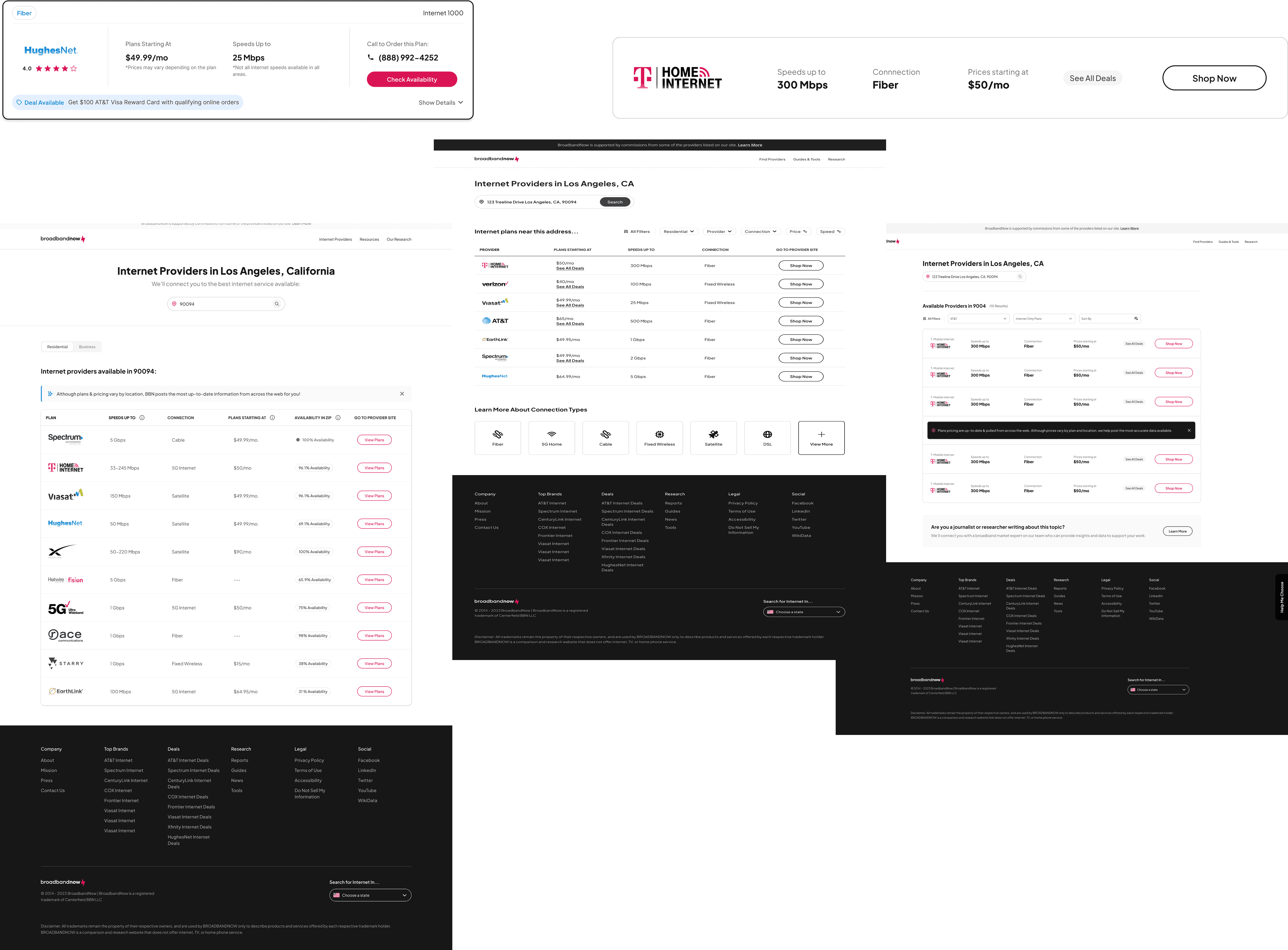
The better layout wasn't the right launch.
We tested both. A table layout performed better for side-by-side comparison, but we made a deliberate call to launch with the card stack instead.
Why? The table required significant engineering lift. Rather than delay the launch, we shipped the card layout with cleaner content and better personalization — and roadmapped the table for phase two.
DEVELOPMENT & LAUNCH
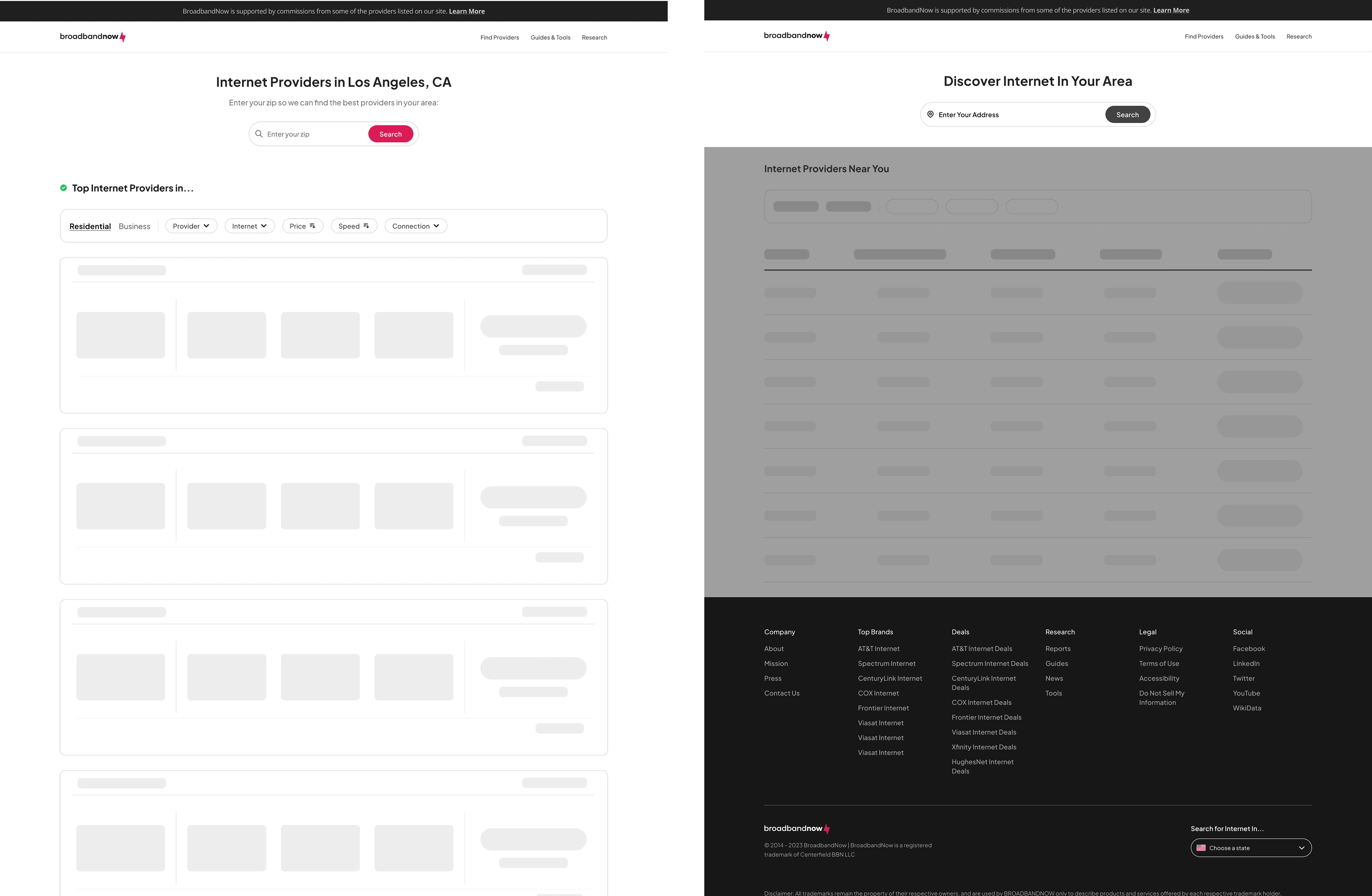
Design doesn't stop at handoff
We ran two rounds of UAT reviews with engineering in staging — catching spec discrepancies before they reached QA. Annotated breakpoints across mobile, tablet, and desktop ensured nothing got lost in translation.

SOLUTION
From broken to trusted
The research kept pointing to the same root cause — the site was designed to rank, not to help. These before and afters show what it looks like when you flip that priority.
Home page — from cluttered to clear

City page — from generic to personalized

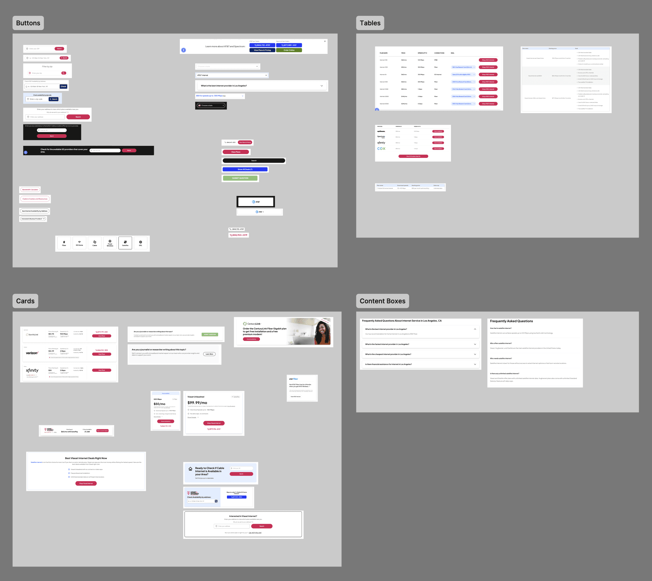
Foundation
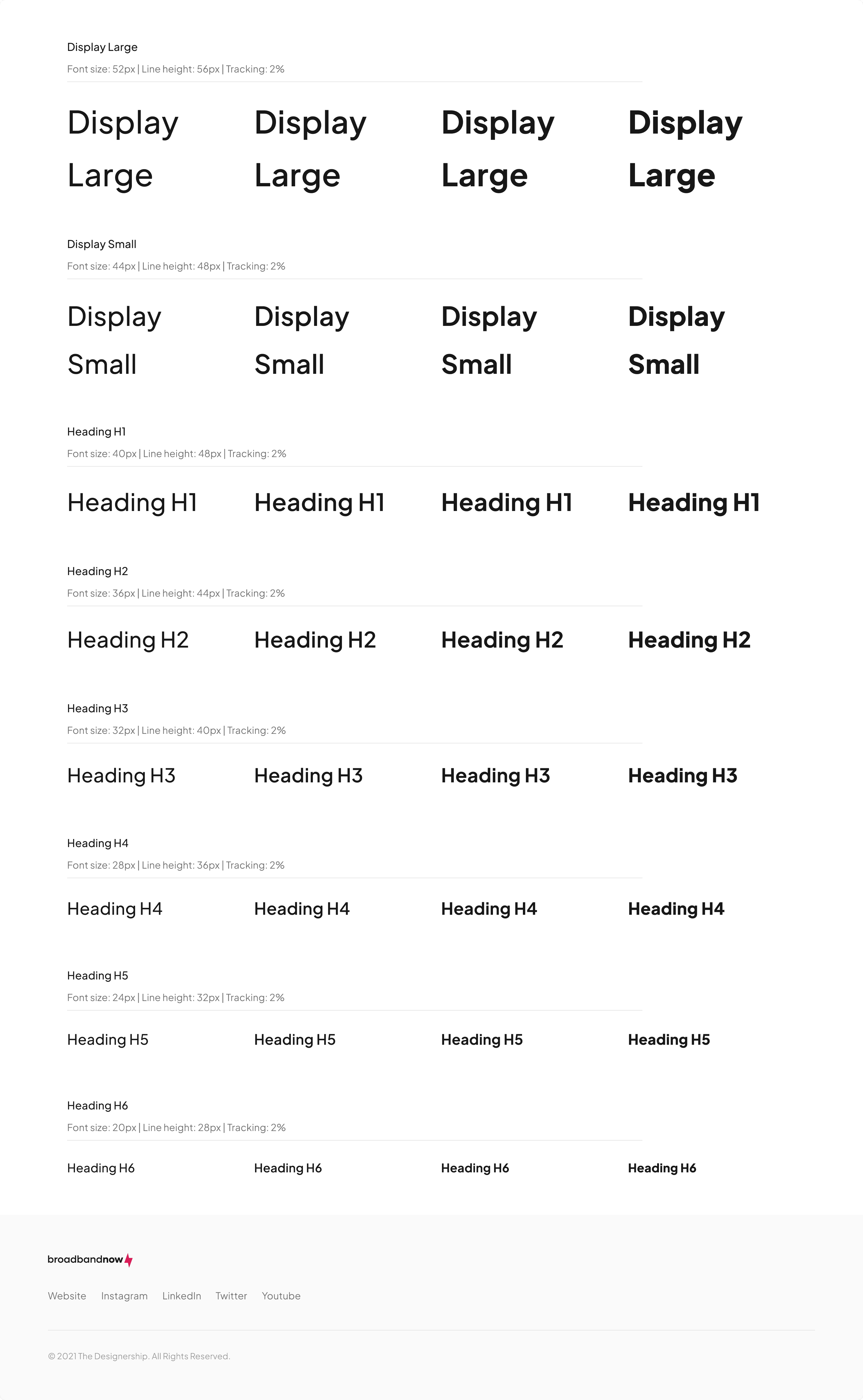
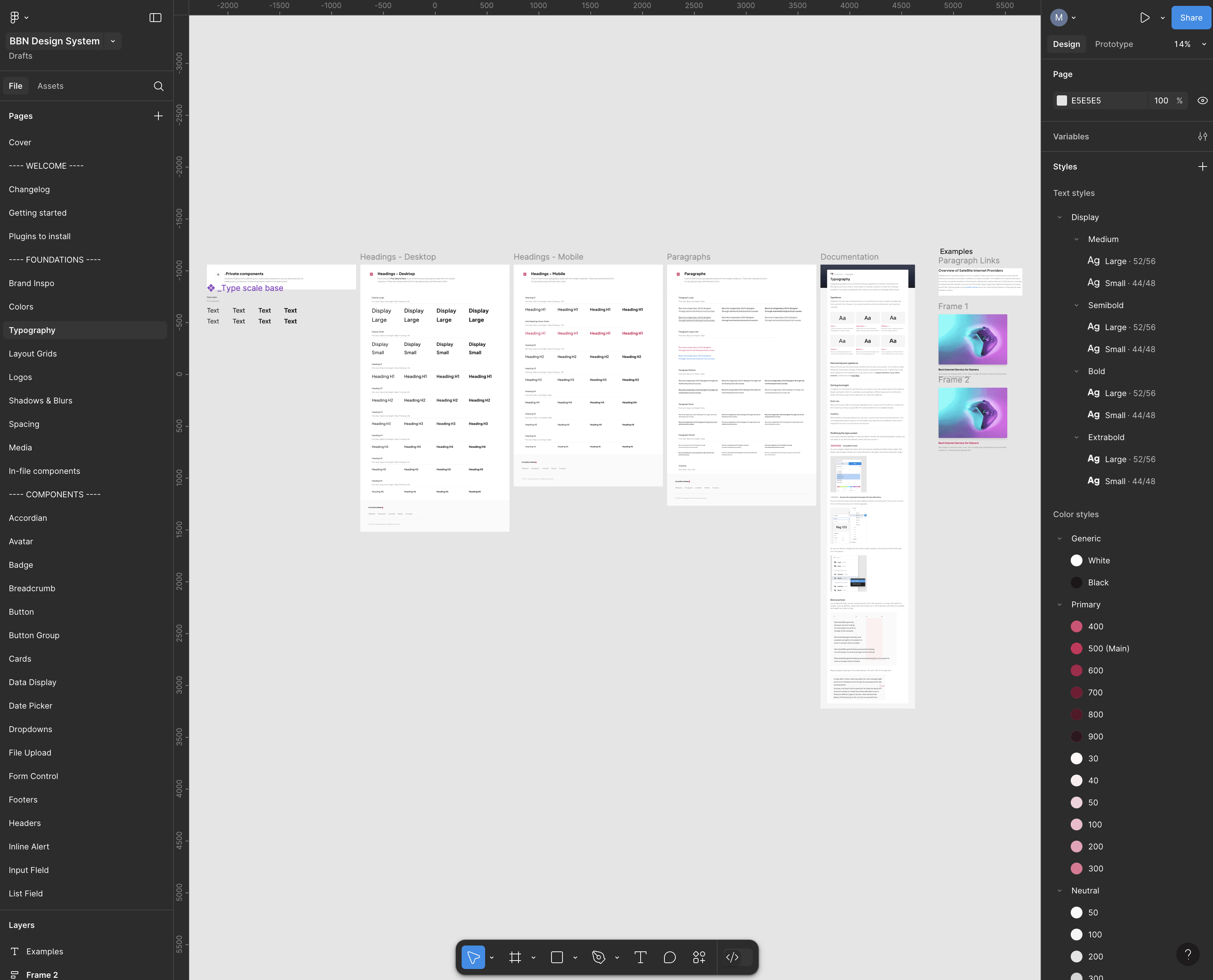
BBN had no design system before this project — every component was hard-coded, one-off, and inconsistent.
We built one from scratch. Brand, color, and type were the first decisions — because without them, every component would have been a one-off conversation with engineering. These three foundations are what made a 50% reduction in dev time possible.


Structure
Components organized by page template — rolled out incrementally to manage engineering handoff

Designed around real people, not assumptions
We let user research drive every decision — from what information to surface first, to how to build trust with someone who's never heard of BBN.
01
Availability first
Users told us irrelevant results were their biggest frustration. We made zip-code verification the entry point — so every result would show the closest availability at the top.
02
Personalization over a generic list
One-size-fits-all results weren't working. We added filters for provider, connection type, price, and speed — giving users control over what they actually cared about.
Insights 01 — 02 in context
03
Price and speed as the visual anchors
These were the two deciding factors in every interview. We made them impossible to miss — leading the hierarchy on every provider card.
04
Clarity over jargon
Users didn't understand connection types. A single tooltip reduced confusion without cluttering the interface.
05
Trust through transparency
Users were leaving BBN to verify information elsewhere. Unbiased disclaimers and visible reviews gave them a reason to stay.
Insights 03 — 05 in context
IMPACT
The numbers moved, so did the experience
The redesign addressed every core problem we identified — easier comparison drove conversions, consistent branding built trust, cleaner structure improved SEO performance, and the design system cut development time by 50%.
call rate
3%
conversion
13%
engagement
15%
sales
23%
what's next
The north star
We shipped phase one — a card layout that balanced user needs with engineering constraints. But the data tells us table layouts are better for comparison-heavy decisions, and that's where we're headed.
The roadmap:
Address-level check for more accurate availability
A/B test a table layout against the current card stack
Refine filters and personalization toward the north star vision
Roll out remaining page templates using the new design system
Document design system usage for designers and engineering
