SHIPPED
BroadbandNow
find internet in your area

MY ROLE
Product Designer


Our main objective was to redesign the core search experience to increase conversions while positioning BBN to become the #1 trusted resource for internet plan comparison.

I led a total of 40 unmoderated usability tests across mobile & desktop to better understand how the targeted demographic was searching for internet & using our current BBN site.

Key Research Questions
How do users currently search for and compare internet providers?
What information is critical to their decision-making?
Where does our current experience fail them?
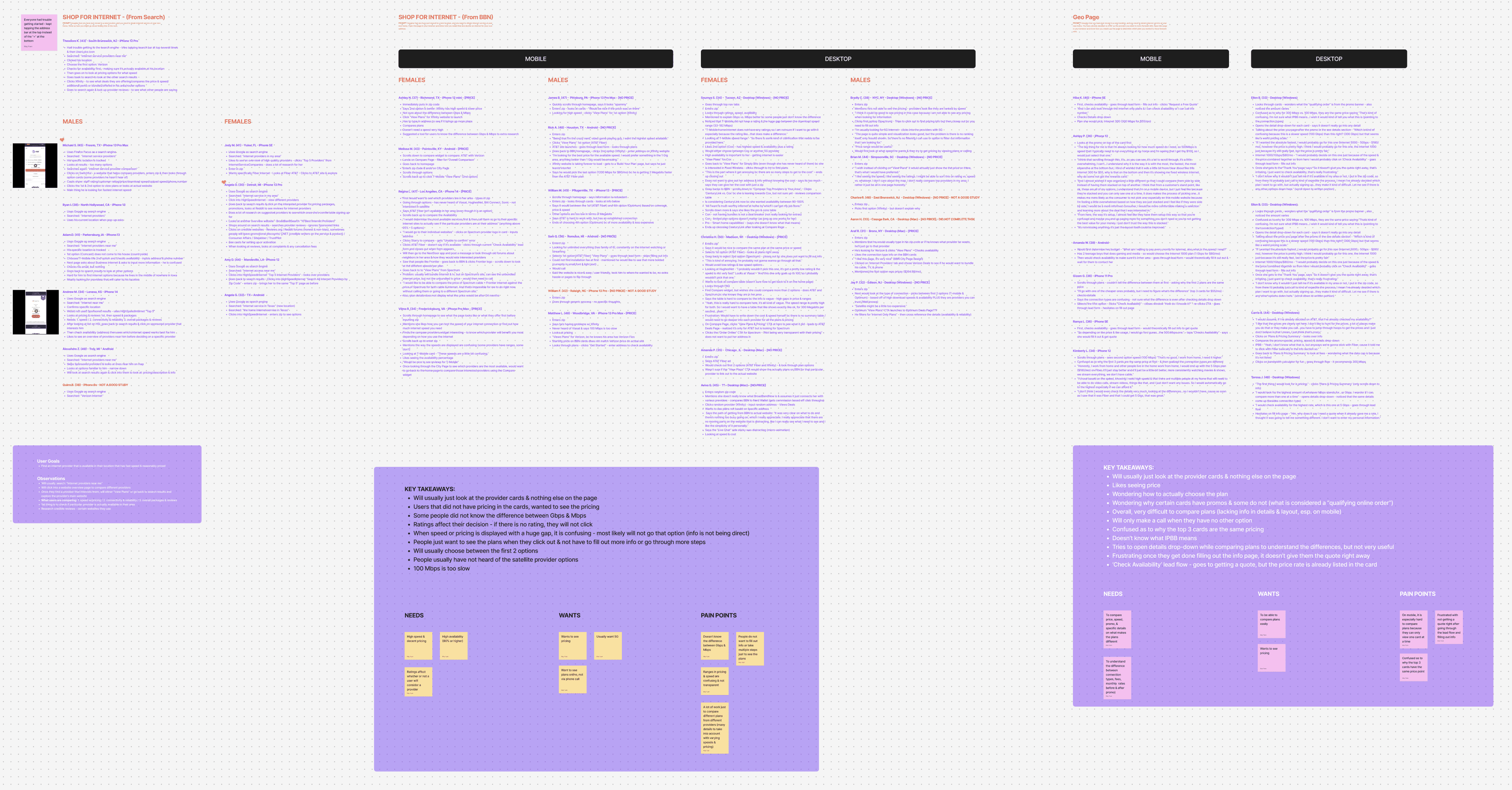
#1 priority was finding a reliable provider in their area
Pricing & speed were the main specs looked at when comparing plans
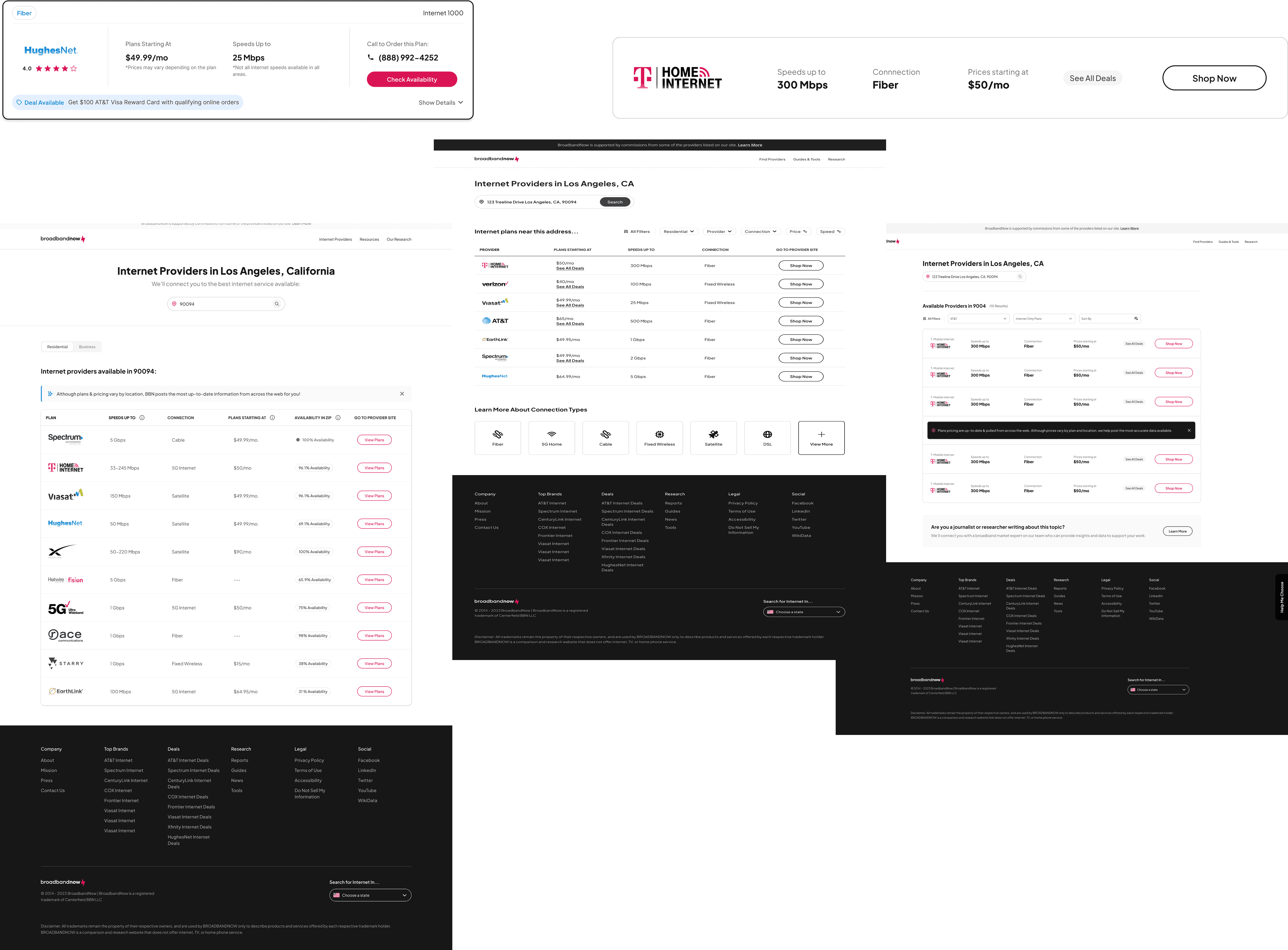
Comparing provider plans quickly
Reviews are important to them
Difficult time differentiating & understanding provider plans
Frustrated because they could not see pricing
Time wasted due to difficulty comparing plans
People lacked trust in the brand—relied on multiple resources of unbiased content in order to make a decision
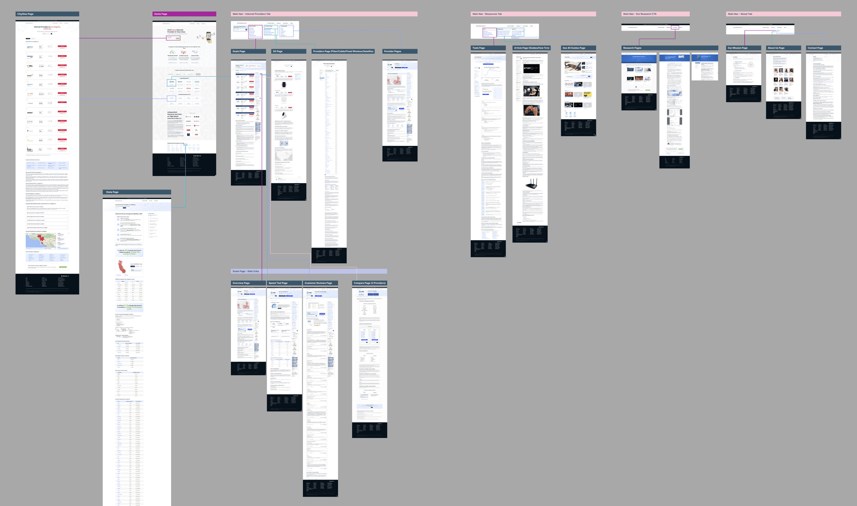
DEVELOPMENT & LAUNCH
We ended up doing 2x rounds of UAT reviews with the engineers before it went over to QA to ensure design specifications were built out accordingly while it was in staging.

IMPACT
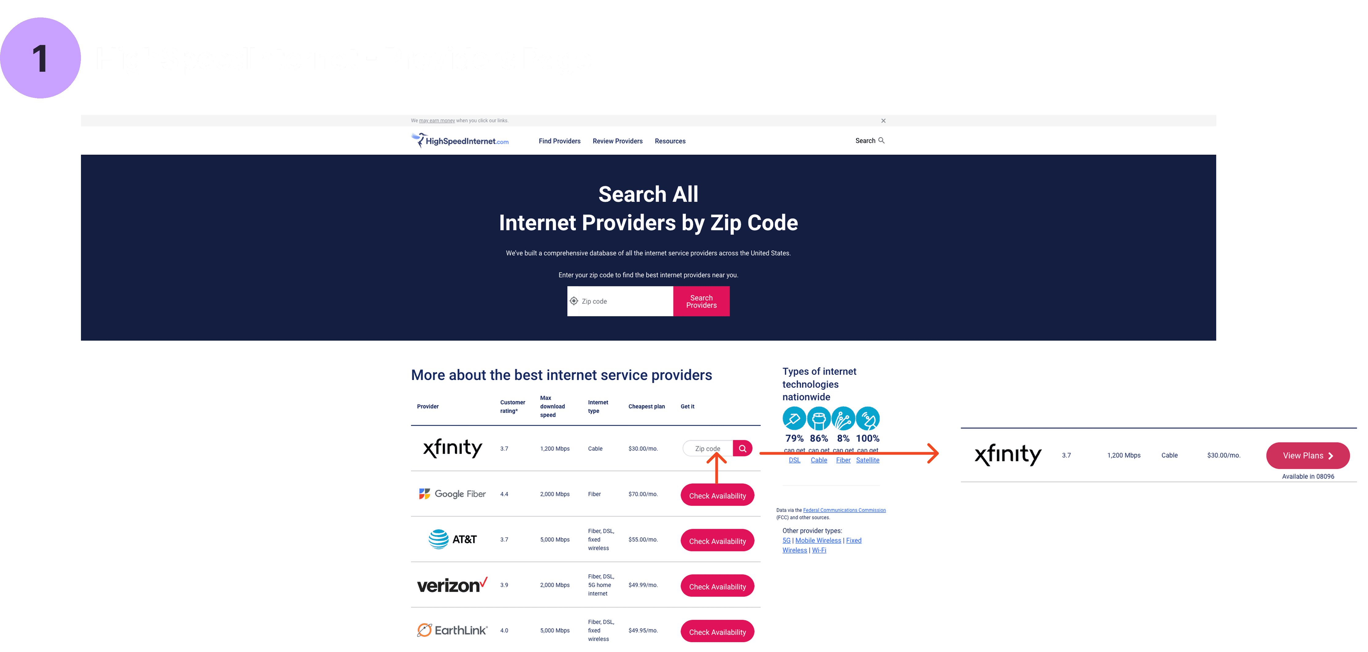
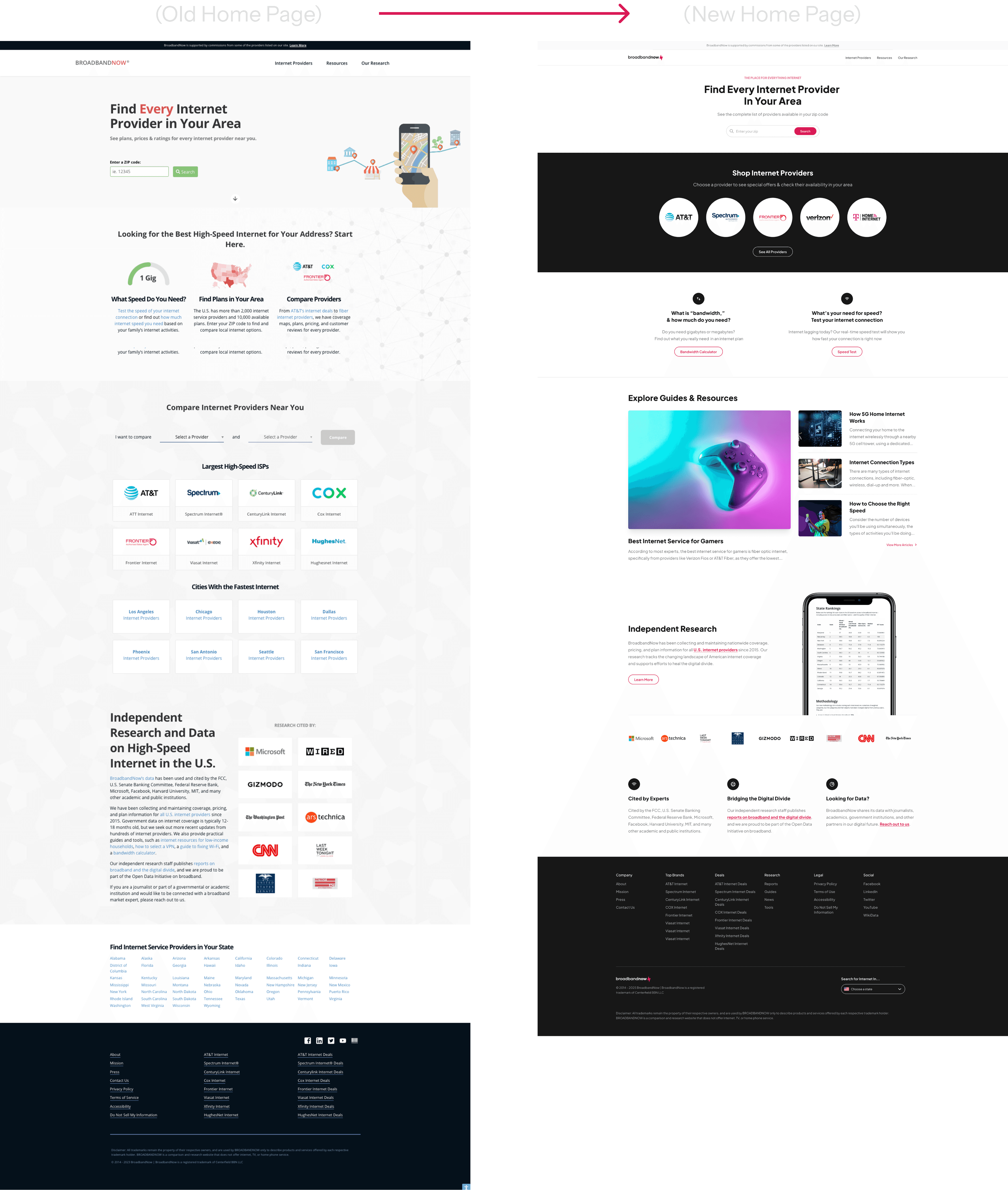
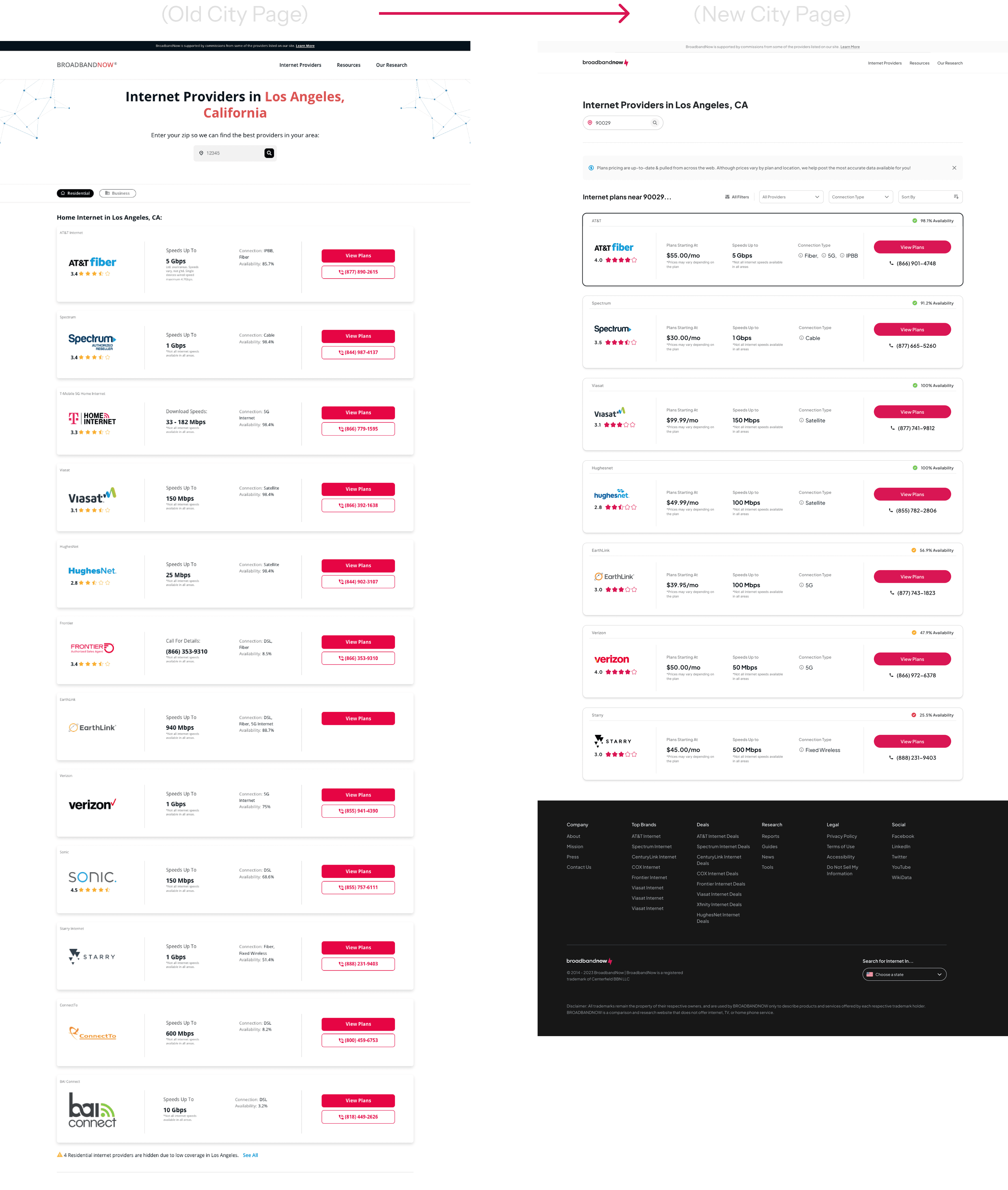
Transformed search from generic to personal
The redesigned experience successfully addressed our core problems:
• Increased conversions by making provider comparison easier
• Built trust through consistent branding and unbiased content
• Improved SEO performance with cleaner, more accessible structure
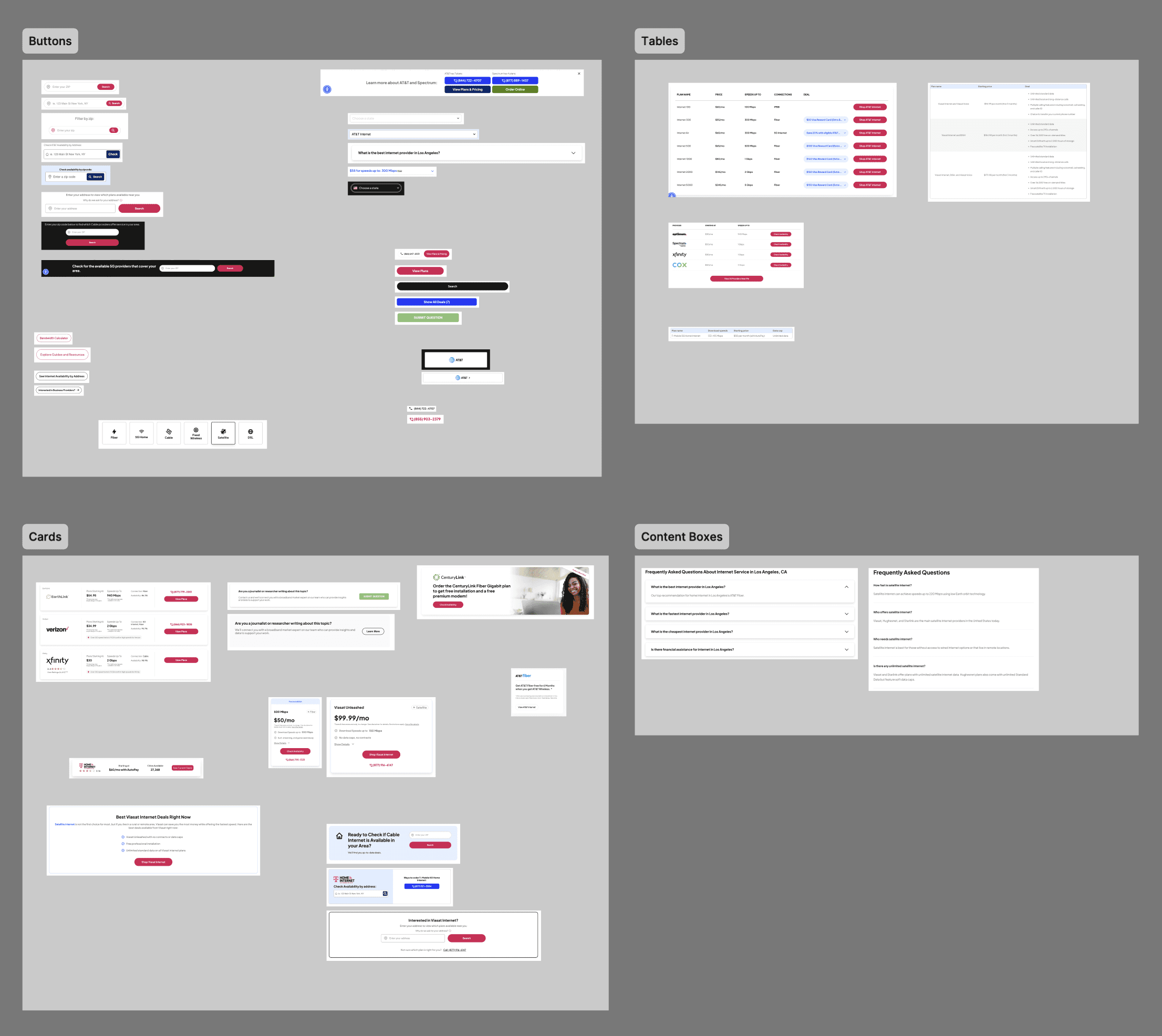
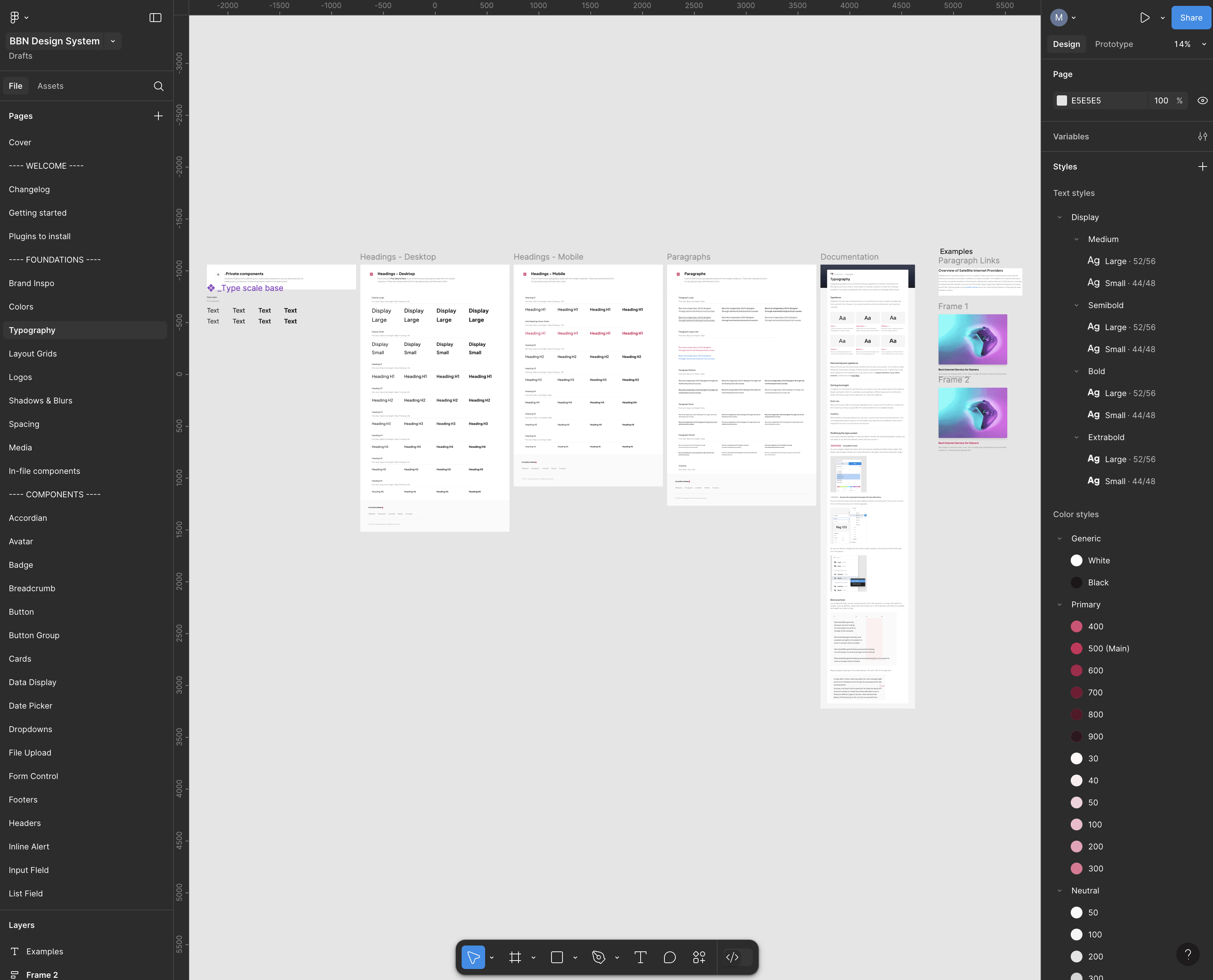
• Established a design system that reduced development time by 50%
WHAT'S NEXT
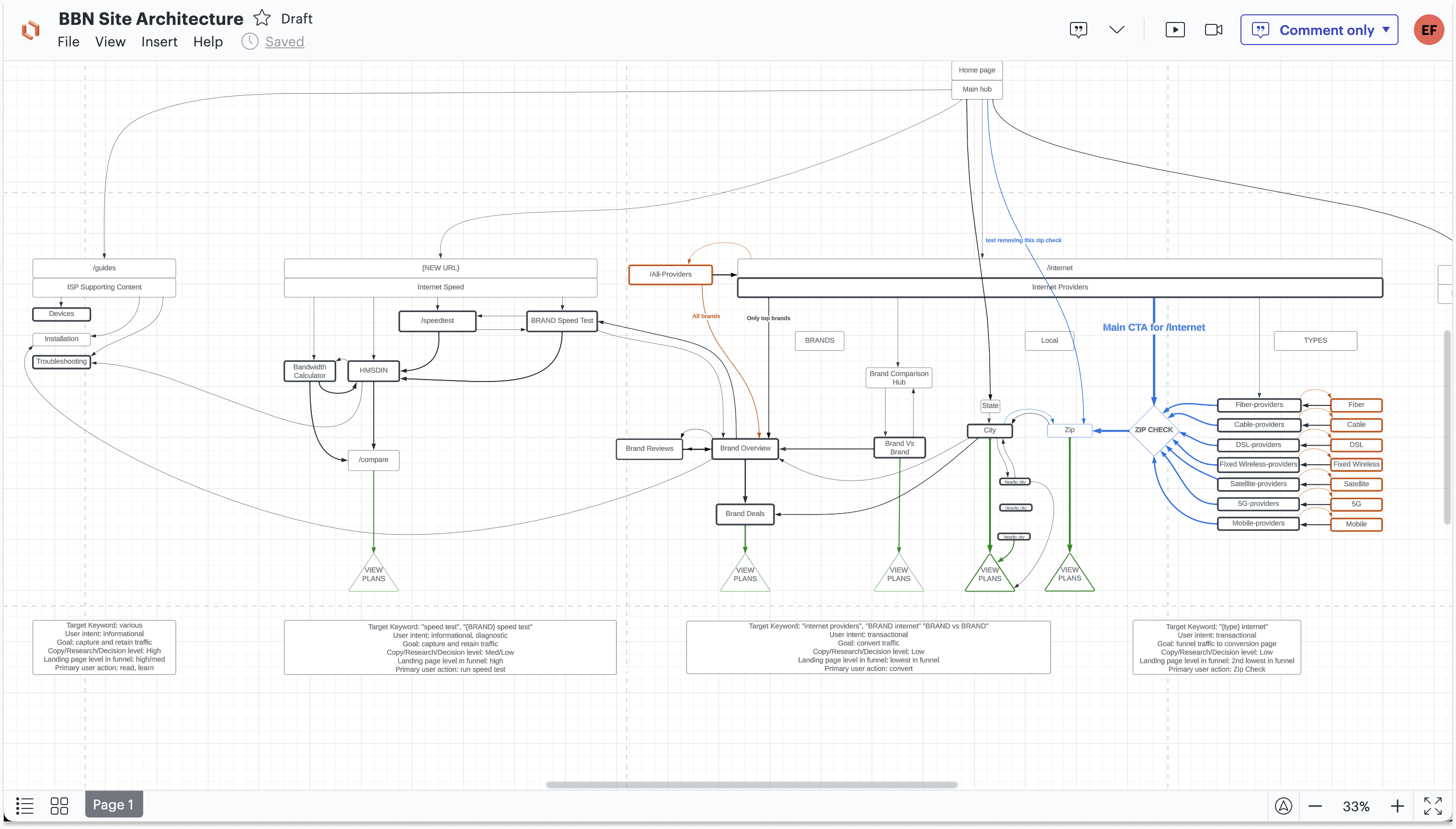
The Future
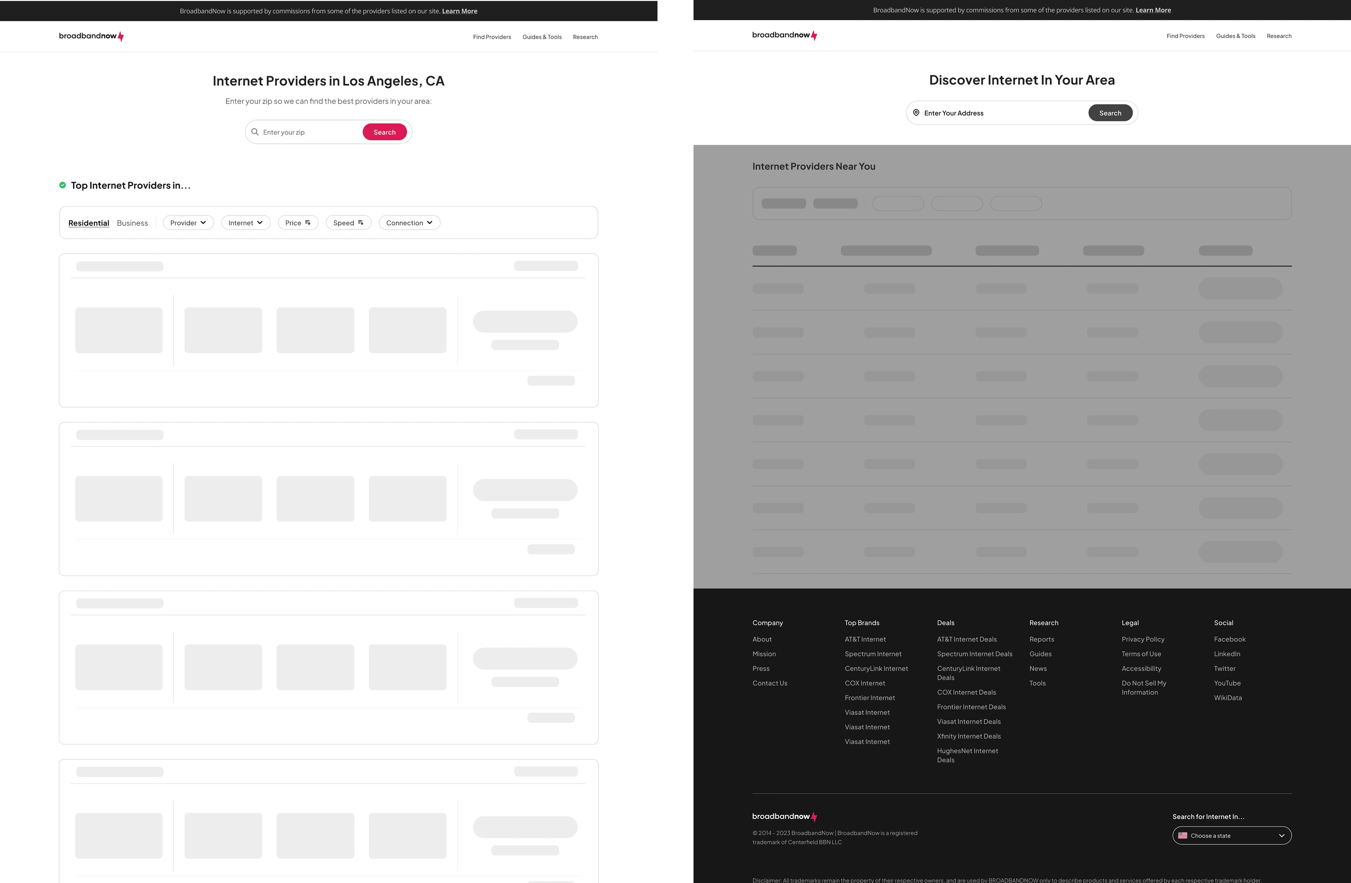
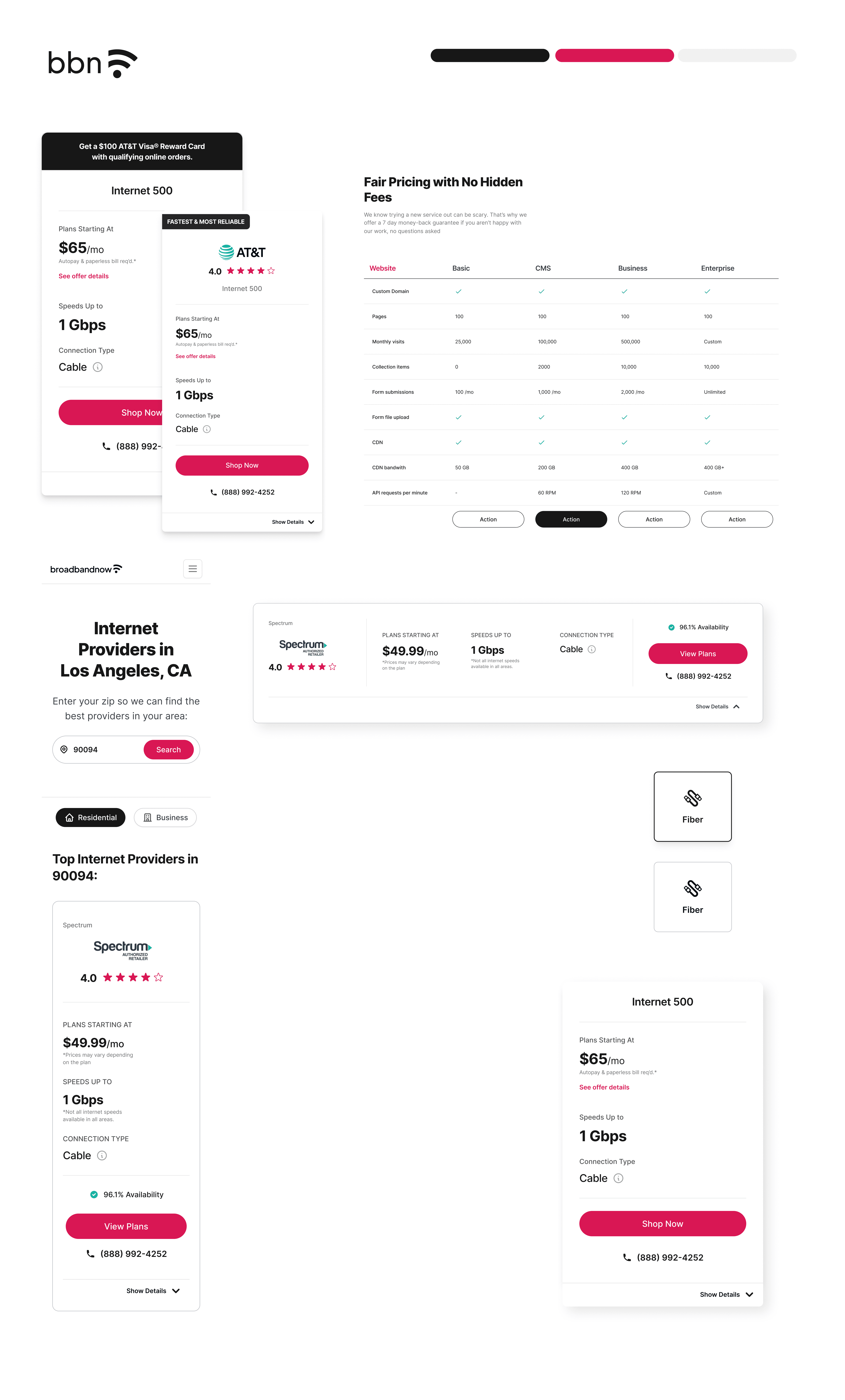
We planned to break this project out into 3 phases to reach our north star vision which was a table layout. Table layouts are much better at comparing content and organizing a lot of information at once. We initially designed this version first after discovering all the user insights but decided to pair the designs back for ease of transition for developers.
For the future, we plan to:
Have address check for more accurate recommendations
A/B test a table layout
Work our way up to the north star vision while refining filters and personalization
Update and roll out the rest of the page templates using the new design system
Maintain design system and create documentation on how & where type, color, components are used for other designers and engineering team


